Building a Financial Trading Toolbox in Python: Simple Moving Average
Python, with its powerful data analysis package pandas, has taken the financial markets analysis world by storm. It enables researchers to perform sophisticated analysis that once required dedicated and expensive packages.
(A version of this post was published on Towards Data Science on September 16, 2019)
With this article, we are going to wade in the water of financial market analysis using Python and pandas. We will plot a market price series and add a basic indicator. With next articles, we will learn step by step how to swim by building a complete toolbox that can be used to create systems to trade stocks or other financial assets.
Most of the concepts that we are going to implement belong to a domain known as Technical Analysis, a discipline that aims at evaluating investments and identify opportunities by analyzing data generated by trading activities, such as price and volume.
Introducing the Moving Average
The moving average is one of the simplest technical indicators, yet it can be used and combined in many different ways to provide the backbone of trading systems and frameworks for investment decision making.
Moving averages, as all technical indicators, are based on the price series of a financial instrument. In our example we will consider the daily price series of the SPDR S&P 500 ETF Trust (symbol: SPY), an Exchange Traded Fund (ETF) traded on the NYSE Arca exchange. This ETF mimics the performance of the S&P 500 stock market index. We want to use moving averages to make investment decisions - to decide when to buy or sell shares in SPY.
There are actually several different kinds of moving averages. The three most commonly used are:
- Simple Moving Average
- Linearly Weighted Moving Average
- Exponentially Smoothed Moving Average
The examples in this article will focus on the Simple Moving Average (SMA). Its construction is quite simple: we first define a rolling window of length $n$ (a number of days in our example - let’s use $n=5$). We then start from day 5 and consider all the prices from day 1 to day 5 (included). We compute the arithmetic mean of those prices (by summing them up and dividing by 5): that is the value of our SMA for day 5. Then, we move on to day 6, we take out the price on day 1, include the price on day 6 and compute the next SMA. We keep repeating the process until we reach the last price in our series. This table should make the process clearer:
| Date | Price | SMA 5 | Prices Included |
|---|---|---|---|
| 1 | 1 | NaN | - |
| 2 | 7 | NaN | - |
| 3 | 2 | NaN | - |
| 4 | 4 | NaN | - |
| 5 | 3 | 3.4 | 1, 7, 2, 4, 3 |
| 6 | 2 | 3.6 | 7, 2, 4, 3, 2 |
| 7 | 4 | 3.0 | 2, 4, 3, 2, 4 |
| 8 | 8 | 4.2 | 4, 3, 2, 4, 8 |
| 9 | 1 | 3.6 | 3, 2, 4, 8, 1 |
| 10 | 8 | 4.6 | 2, 4, 8, 1, 8 |
You have noticed that the first 4 values for our moving average are missing: until day 5 there are not enough days to fill a 5 day window.
A visual example
Let us put this concept to work and create some practical examples using Python, pandas and Matplotlib. I am assuming that you have at least some basic Python knowledge and know what pandas DataFrame and Series objects are. If this is not the case, you can find a gentle introduction here. I also suggest that you use a Jupyter notebook to follow along with the following code. Here you can find a handy Jupyter tutorial. However, you always execute the code in your favourite way, through a script or interactive prompt. We start by loading the required libraries and checking their versions:
import pandas as pd
import matplotlib.pyplot as plt
import matplotlib as mpl
import sys

print('Python version: ' + sys.version)
print('pandas version: ' + pd.__version__)
print('matplotlib version: ' + mpl.__version__)
Python version: 3.7.4 (default, Aug 13 2019, 15:17:50)
[Clang 4.0.1 (tags/RELEASE_401/final)]
pandas version: 0.25.1
matplotlib version: 3.1.1
If you are using Jupyter, it’s a good idea to display the chart within the notebook:
%matplotlib inline
If you are executing your in the prompt on through a script editor, you will need to add plt.show() to the code each time we are plotting a chart in order to make it visible.
Next, we load data into a DataFrame. I have obtained a CSV file of daily data for SPY from Yahoo! Finance. You can download my csv file here.
datafile = 'data/SPY.csv'
data = pd.read_csv(datafile, index_col = 'Date')
data
| Open | High | Low | Close | Adj Close | Volume | |
|---|---|---|---|---|---|---|
| Date | ||||||
| 2014-08-20 | 198.119995 | 199.160004 | 198.080002 | 198.919998 | 180.141846 | 72763000 |
| 2014-08-21 | 199.089996 | 199.759995 | 198.929993 | 199.500000 | 180.667160 | 67791000 |
| 2014-08-22 | 199.339996 | 199.690002 | 198.740005 | 199.190002 | 180.386368 | 76107000 |
| 2014-08-25 | 200.139999 | 200.589996 | 199.149994 | 200.199997 | 181.301010 | 63855000 |
| 2014-08-26 | 200.330002 | 200.820007 | 200.279999 | 200.330002 | 181.418716 | 47298000 |
| ... | ... | ... | ... | ... | ... | ... |
| 2019-08-13 | 287.739990 | 294.149994 | 287.359985 | 292.549988 | 292.549988 | 94299800 |
| 2019-08-14 | 288.070007 | 288.739990 | 283.760010 | 283.899994 | 283.899994 | 135622100 |
| 2019-08-15 | 284.880005 | 285.640015 | 282.390015 | 284.649994 | 284.649994 | 99556600 |
| 2019-08-16 | 286.480011 | 289.329987 | 284.709991 | 288.850006 | 288.850006 | 83018300 |
| 2019-08-19 | 292.190002 | 293.079987 | 291.440002 | 292.329987 | 292.329987 | 53571800 |
1258 rows × 6 columns
Our data frame has six columns in total, one for Open, High, Low, Close, Adjusted Close prices and Volume respectively. To keep things simple, in our examples we will use only the Adjusted Close prices. That is the price series that reflects dividends, stock splits and other corporate events that affect stock returns.
close = data['Adj Close']
close.index = pd.to_datetime(close.index) # This converts the index to pandas datetime
close
Date
2014-08-20    180.141846
2014-08-21    180.667160
2014-08-22    180.386368
2014-08-25    181.301010
2014-08-26    181.418716
                 ...
2019-08-13    292.549988
2019-08-14    283.899994
2019-08-15    284.649994
2019-08-16    288.850006
2019-08-19    292.329987
Name: Adj Close, Length: 1258, dtype: float64
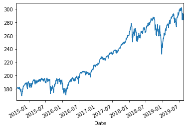
We can easily plot the price series for visual inspection:
close.plot()
<matplotlib.axes._subplots.AxesSubplot at 0x103f00710>
Pandas makes calculating a 50 day moving average easy. Using the rolling() method we set a 50 day window, on which we calculate the arithmetic average (mean) using the mean() method:
sma50 = close.rolling(window=50).mean()
sma50
Date
2014-08-20           NaN
2014-08-21           NaN
2014-08-22           NaN
2014-08-25           NaN
2014-08-26           NaN
                 ...
2019-08-13    293.540820
2019-08-14    293.635375
2019-08-15    293.696567
2019-08-16    293.805137
2019-08-19    293.926582
Name: Adj Close, Length: 1258, dtype: float64
As we expect, the first 49 values of the series are empty:
sma50.iloc[45:52]
Date
2014-10-23           NaN
2014-10-24           NaN
2014-10-27           NaN
2014-10-28           NaN
2014-10-29    178.725250
2014-10-30    178.750461
2014-10-31    178.806655
Name: Adj Close, dtype: float64
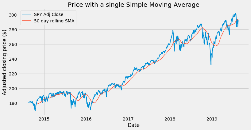
We can now plot our first moving average on a chart. To make our chart look nicer, we can use a predefined style:
plt.style.use('fivethirtyeight')
You can experiment with different styles, check out what is available here.
We can now plot our chart:
plt.figure(figsize = (12,6))
plt.plot(close, label='SPY Adj Close', linewidth = 2)
plt.plot(sma50, label='50 day rolling SMA', linewidth = 1.5)
plt.xlabel('Date')
plt.ylabel('Adjusted closing price ($)')
plt.title('Price with a single Simple Moving Average')
plt.legend()
<matplotlib.legend.Legend at 0x103f00410>
If you’re not using Jupyter, you need to add the following line to make the plot visible:
plt.show()
Remember to do the same for each of the next plots.
Use of one moving average
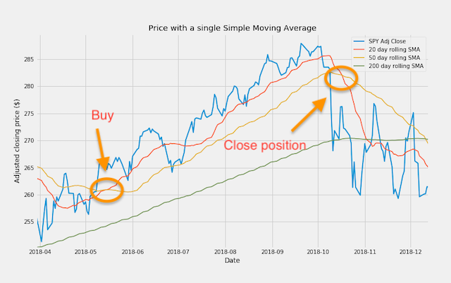
Used on its own, our simple moving average does a good job by smoothing the price movements and helping us to visually identify the trend: when the average line is climbing up, we have an uptrend. When the average points down, we are in a downtrend.
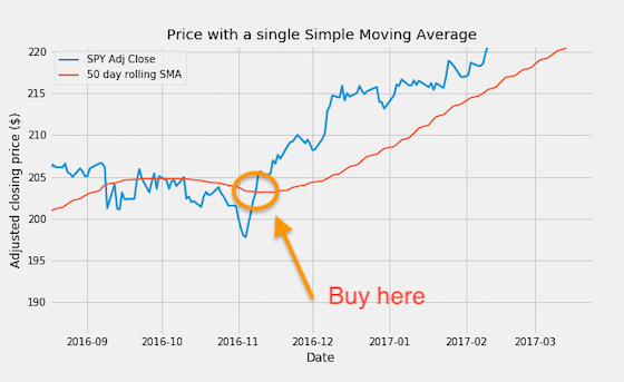
We can do more than that: it is possible to generate trading signals by using one single moving average. When the closing price moves above the moving average from below, we have a buy signal:
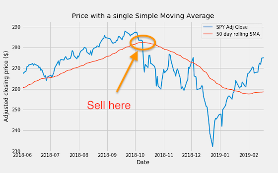
Similarly, when the price crosses the moving average from above, a sell signal is generated.
Selecting date ranges
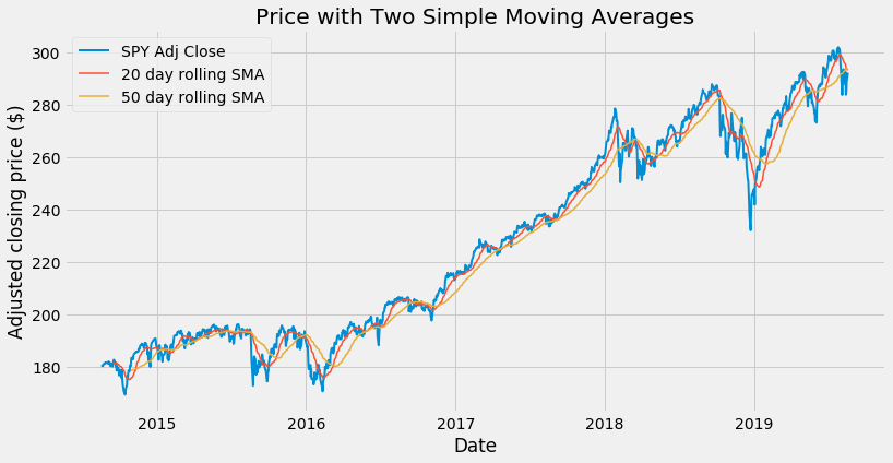
Let’s compare two moving averages with different length, 20 and 50 day respectively:
sma20 = close.rolling(window=20).mean()

plt.figure(figsize = (12,6))
plt.plot(close, label='SPY Adj Close', linewidth = 2)
plt.plot(sma20, label='20 day rolling SMA', linewidth = 1.5)
plt.plot(sma50, label='50 day rolling SMA', linewidth = 1.5)
plt.xlabel('Date')
plt.ylabel('Adjusted closing price ($)')
plt.title('Price with Two Simple Moving Averages')
plt.legend()
<matplotlib.legend.Legend at 0x114e03350>
Our chart is now getting a bit crowded. It would be nice to be able to zoom on a date range of our choice. We could use a plt.xlim() instruction (e.g. plt.xlim('2017-01-01','2018-12-31'): just try to add it to the code above). However, I want to explore a different route: building a new dataframe that includes price and moving averages:
priceSma_df = pd.DataFrame({
      'Adj Close' : close,
      'SMA 20' : sma20,
      'SMA 50' : sma50
     })

priceSma_df
| Adj Close | SMA 20 | SMA 50 | |
|---|---|---|---|
| Date | |||
| 2014-08-20 | 180.141846 | NaN | NaN |
| 2014-08-21 | 180.667160 | NaN | NaN |
| 2014-08-22 | 180.386368 | NaN | NaN |
| 2014-08-25 | 181.301010 | NaN | NaN |
| 2014-08-26 | 181.418716 | NaN | NaN |
| ... | ... | ... | ... |
| 2019-08-13 | 292.549988 | 295.381998 | 293.540820 |
| 2019-08-14 | 283.899994 | 294.689998 | 293.635375 |
| 2019-08-15 | 284.649994 | 293.980998 | 293.696567 |
| 2019-08-16 | 288.850006 | 293.564998 | 293.805137 |
| 2019-08-19 | 292.329987 | 293.286497 | 293.926582 |
1258 rows × 3 columns
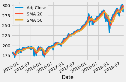
Having all of our series in a single dataframe makes it easy to create a snap plot:
priceSma_df.plot()
<matplotlib.axes._subplots.AxesSubplot at 0x10245ec10>
With this method, however, I cannot easily select the line width: I will keep using a plot function call for each line. On this new data frame, we can easily select a date range (e.g. dates in 2017 and 2018, included) and plot only data within that range:
plt.figure(figsize = (12,6))
plt.plot(priceSma_df['2017':'2018']['Adj Close'], label='SPY Adj Close', linewidth = 2)
plt.plot(priceSma_df['2017':'2018']['SMA 20'], label='20 days rolling SMA', linewidth = 1.5)
plt.plot(priceSma_df['2017':'2018']['SMA 50'], label='50 days rolling SMA', linewidth = 1.5)
plt.xlabel('Date')
plt.ylabel('Adjusted closing price ($)')
plt.title('Price with Two Simple Moving Averages - Selected Date Range')
plt.legend()
<matplotlib.legend.Legend at 0x11521af90>
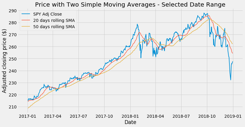
Slicing data by date range is one of the great features of pandas. All the following work:
-
priceSma_df['2017-04-01':'2017-06-15']: range defined by two specific dates -
priceSma_df['2017-01]: prices in a given month -
priceSma_df['2017]: prices in a given year
Use of two moving averages
By combining two moving averages, we can use a technique called double crossover method. With this setting, a buy signal is generated whenever the shorter moving average crosses the longer from below. Similarly, a sell signal is generated whenever the shorter moving average crosses the longer from above:
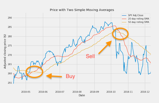
Compared with the technique that uses just one single moving average and the price, the double crossover method produces fewer whipsaws. On the other hand, it can generate signals with some delay.
Use of three moving averages
If we can use two moving averages together, why not three then?
sma200 = close.rolling(window=200).mean()
priceSma_df['SMA 200'] = sma200
priceSma_df
| Adj Close | SMA 20 | SMA 50 | SMA 200 | |
|---|---|---|---|---|
| Date | ||||
| 2014-08-20 | 180.141846 | NaN | NaN | NaN |
| 2014-08-21 | 180.667160 | NaN | NaN | NaN |
| 2014-08-22 | 180.386368 | NaN | NaN | NaN |
| 2014-08-25 | 181.301010 | NaN | NaN | NaN |
| 2014-08-26 | 181.418716 | NaN | NaN | NaN |
| ... | ... | ... | ... | ... |
| 2019-08-13 | 292.549988 | 295.381998 | 293.540820 | 277.238597 |
| 2019-08-14 | 283.899994 | 294.689998 | 293.635375 | 277.327894 |
| 2019-08-15 | 284.649994 | 293.980998 | 293.696567 | 277.444337 |
| 2019-08-16 | 288.850006 | 293.564998 | 293.805137 | 277.589019 |
| 2019-08-19 | 292.329987 | 293.286497 | 293.926582 | 277.731843 |
1258 rows × 4 columns
start = '2016'
end = '2019'

plt.figure(figsize = (12,6))
plt.plot(priceSma_df[start:end]['Adj Close'], label='SPY Adj Close', linewidth = 2)
plt.plot(priceSma_df[start:end]['SMA 20'], label='20 day rolling SMA', linewidth = 1.5)
plt.plot(priceSma_df[start:end]['SMA 50'], label='50 day rolling SMA', linewidth = 1.5)
plt.plot(priceSma_df[start:end]['SMA 200'], label='200 day rolling SMA', linewidth = 1.5)
plt.xlabel('Date')
plt.ylabel('Adjusted closing price ($)')
plt.title('Price with a single Simple Moving Average')
plt.legend()
<matplotlib.legend.Legend at 0x11572bdd0>
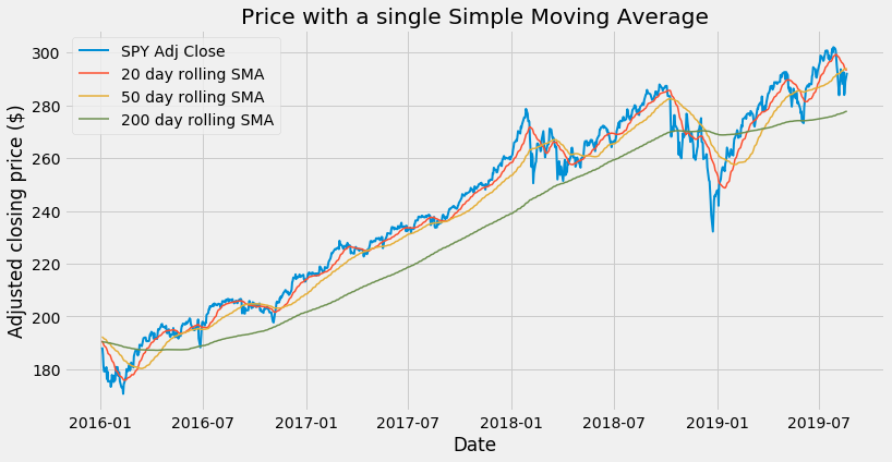
See how the long term 200 SMA helps us to identify the trend in a very smooth manner.
This brings us to the triple crossover method. The set of moving averages we have used, with length 20, 50 and 200 day respectively, is actually widely used among analysts. We can choose to consider a buy signal when the 20 SMA crosses the 50 SMA from below, but only when both averages are above the 200 SMA. All the buy crosses that occur below the 200 SMA will be disregarded.
The examples in this article are just some of the many possibilities that can be generated by combining price and moving averages of different length. Also, price and moving averages can be combined with other available technical indicators or indicators that we can create ourselves. Python and pandas provide all the power and flexibility needed to research and build a profitable trading system.