Matplotlib OHLC and Candlestick Charts Get a Revamp
Matplotlib enables Python users to create beautiful and publication quality data visualizations. However, the capability to create OHLC and candlestick charts has so far been limited. The mpl-finance library, the Matplotlib component that takes care of drawing those charts, had been deprecated and relegated to a separate and, until recently, neglected package.
If you, like me, are interested in using Matplotlib to create charts to study financial markets, you have reasons to be happy: mpl-finance has now a new maintainer, Daniel Goldfarb, and a new revamped version is going to be released soon at the beginning of 2020.
The API of the current mpl-finance library is, to be frank, quite cumbersome. It does not integrate quite well with the pandas data analysis framework, and creating a bar chart requires some data manipulation.
The new version will change all this. To preview it, you just need to run:
pip install mplfinance
Note that the name spelling has changed from the current version, which is installed as mpl-finance (and imported in Python code as mpl_finance). The new version is imported simply as:
import mplfinance as mpf
After loading our data in a data pandas dataframe with Open, High, Low and Close columns, creating a bar chart is as easy as typing:
mpf.plot(data, no_xgaps = True)
which produces a chart like the following:
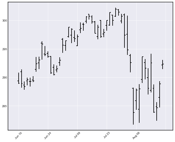
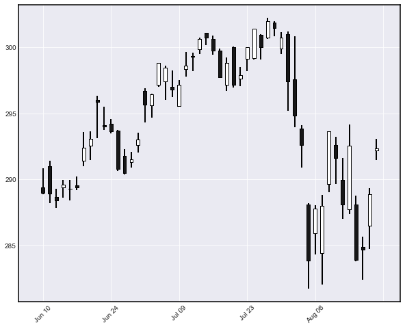
Candlestick charts look good too:
mpf.plot(data, type='candlestick', no_xgaps = True)
As you might have noticed, mplfinance can now remove the gaps generated by non-trading days like weekends and public holidays (by using the no-xgaps option), something that in the current version requires some not-so-straightforward data manipulation.
I am definitely looking forward to seeing the new version released soon.